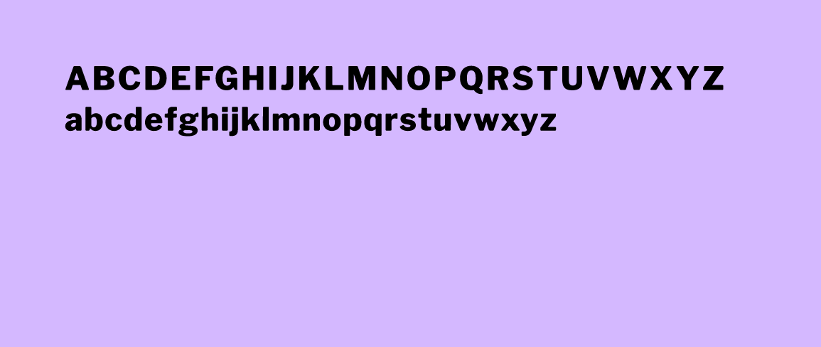
Brand Identity & Guidelines Logo Design Typography
Bute Engineering is a small engineering consultancy that required brand elements for everything from a logo to capabilities deck templates, along with assistance identifying their value proposition.
The founders and I did exploratory exercises that included questions about their ideal clients, what they believe in, and how they want to be perceived by the public. One theme visibly emerged during this research; the desire to appear confident, smart-as-hell, and able to get things done in the eyes of prospective clients.
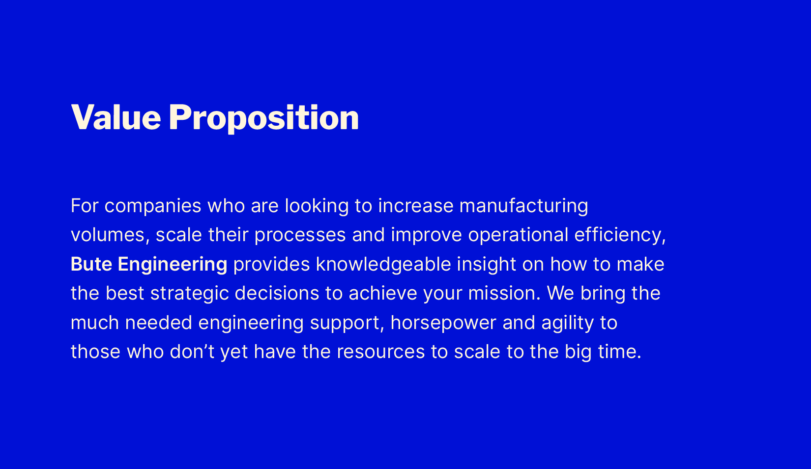
Having identified their company’s core values and offerings, we came up with a value proposition for Bute that could distinguish the company from competitors and allow them to better communicate their gitr’ done value externally.
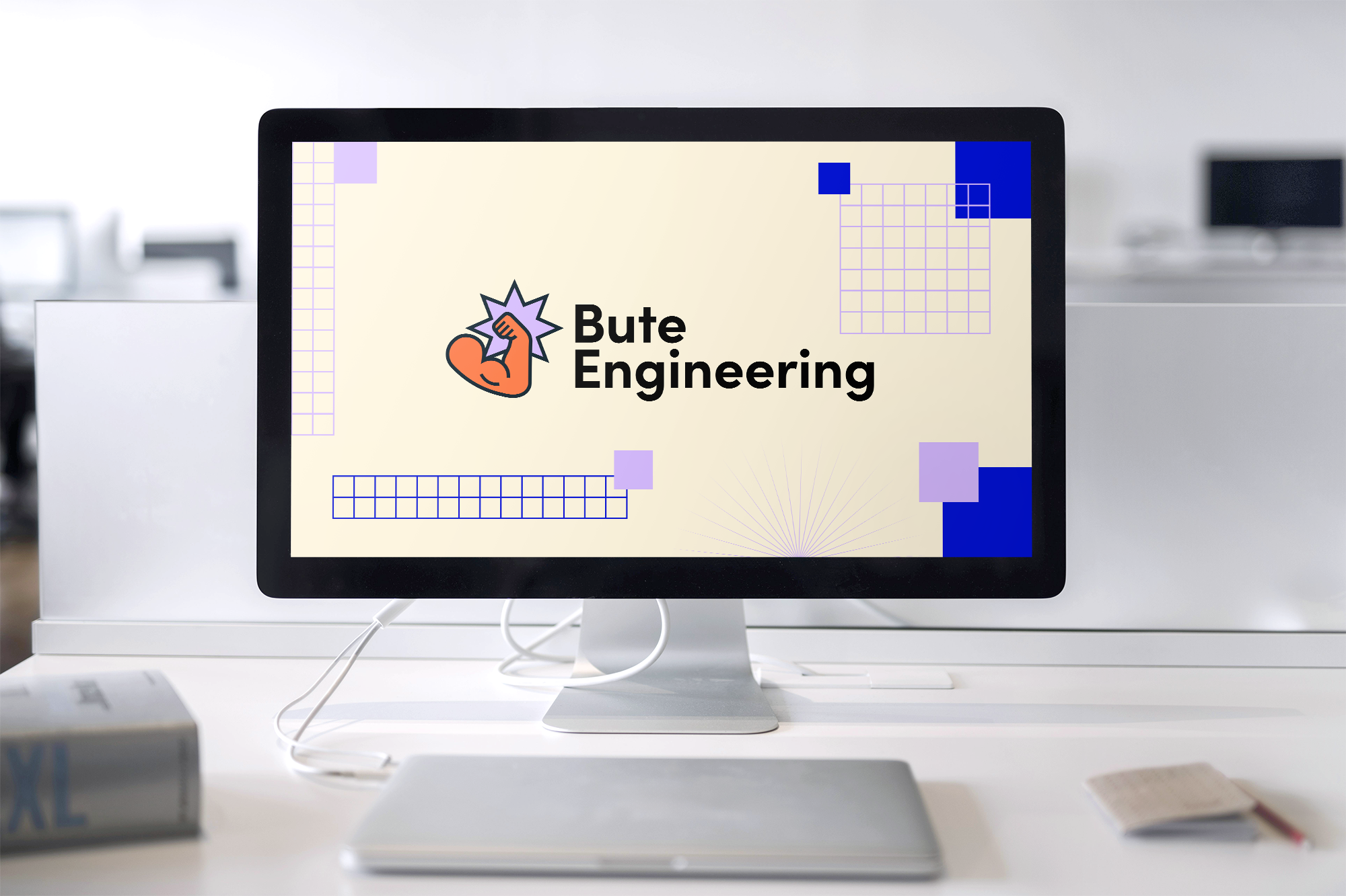
Following the positioning phase, I worked with the founders to build a suitable brand identity that matched their energetic proposition.
Being already familiar with the landscape of hardware engineering, I knew that most businesses are conservative when it comes to branding, choosing to focus more on listing their technical services to communicate who they are, and not in visual identity. But, surely there was a way to strike a balance between scientific and playful?
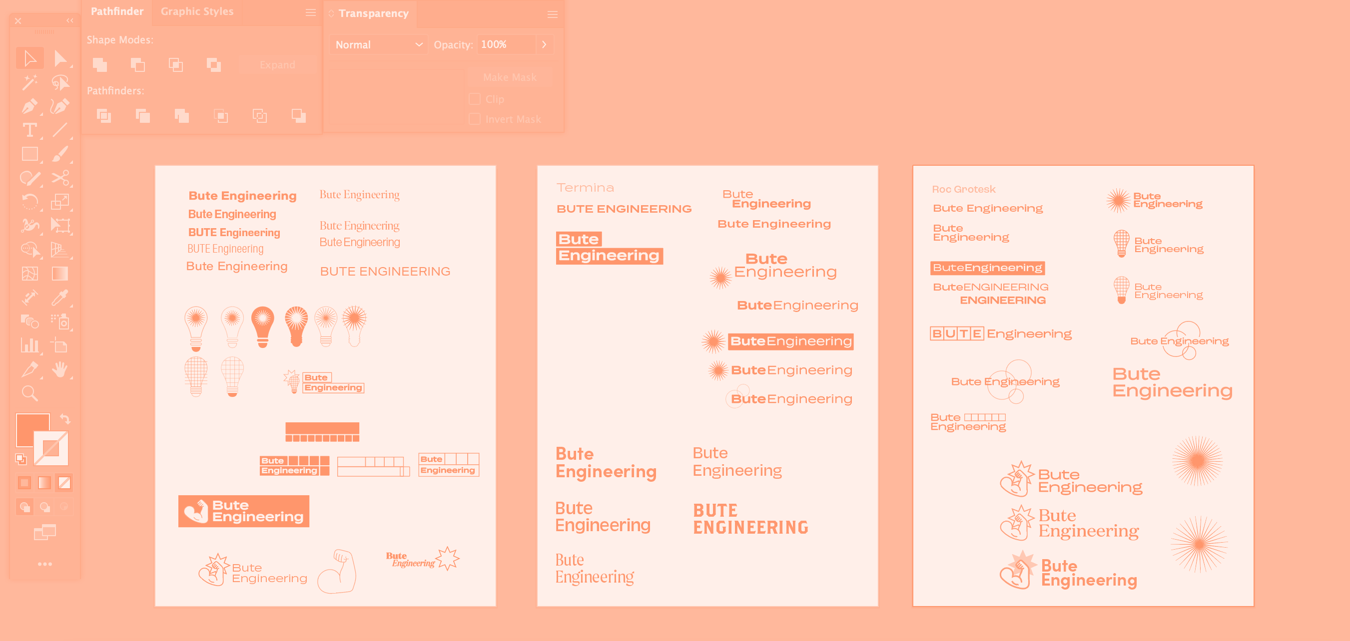
Given mood board examples from the founders that defied some industry standards, I explored iconography and visual symbols that oscillated between logical, minimal, and geometric. I presented three logo concepts; two that were more conventional, and a third that was a truly unexpected wild card. To my surprise (or full expectations), the wild card was the selected concept that we took to the finish line.
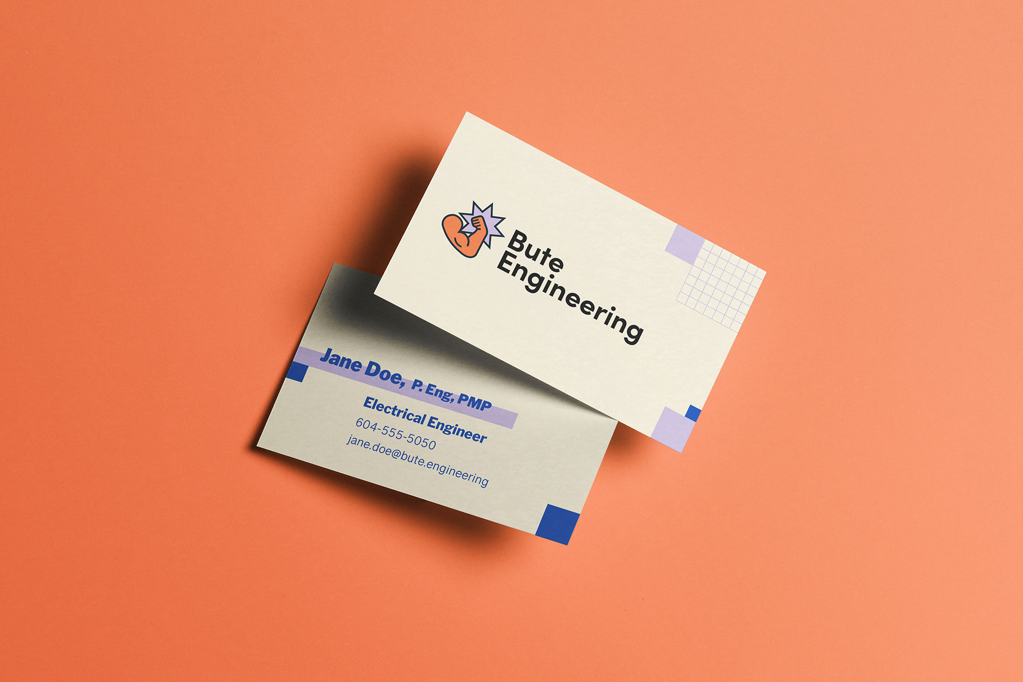
Granted trust in my creative vision, we rounded out the project with a full brand identity guide with typography and logo specifications, a capabilities deck and program report covers.